

From Nude to Bold: The Science of Undertone Matching for Fair Skin Lipstick Lines
A woman with pale skin stands in front of the mirror. She tries a nude lipstick. It looks flat. Almost ashy. Next comes a soft mauve. Suddenly her face brightens. Her teeth look whiter. The color feels alive. That shift isn’t magic. It’s undertone matching at work.
Fair skin shows undertones clearly. Cool (pink or blue hints). Warm (yellow or peachy). Neutral (balanced mix). Pick the wrong base. The lipstick can drag the complexion down. Make it look tired or off. Get it right. The shade enhances natural features. Lips pop without fighting the skin.
Formulators face this challenge daily. Especially when building lipstick lines for fair-skinned consumers. They adjust pigment ratios carefully. Iron oxides dominate color in most formulas. Red (for depth). Yellow (for warmth). Black (for intensity). Tiny changes in those proportions flip a shade from flattering to unflattering.
This post dives into how experts design nudes and bolder tones. Specifically for cool, warm, and neutral fair skin. Real examples show what works. What goes wrong. And why precise color science matters.
Understanding Undertones in Fair Skin
Undertones live beneath the surface. They don’t change with sun exposure. Fair skin amplifies them. Veins on the wrist help spot yours. Blue or purple? Likely cool. Greenish? Probably warm. Mix or unclear? Neutral.
Cool fair skin often shows pinkish cheeks. It flushes easily. Warm fair skin leans golden or peachy. Neutral sits in the middle. No strong pull either way.
Why does this matter for lipstick? Pigments interact with skin’s base tone. A yellow-heavy shade on cool skin turns sallow. A blue-leaning one on warm skin looks harsh. Matching creates harmony.
Designing Nudes for Fair Skin: The Subtle Art
Nudes should look effortless. Like your lips but better. For fair skin, they need to avoid washing out or looking ghostly.
-
Cool fair skin thrives on pink-leaning nudes. Think rosy beige or soft mauve. These pull pink undertones forward. Avoid heavy yellow bases. They create an ashy veil.
-
Warm fair skin suits peachy or golden nudes. Caramel hints or light terracotta work well. They echo natural warmth without overpowering pale complexion.
-
Neutral fair skin handles both sides. Milky rose or true beige often lands perfectly.
Formulators tweak iron oxide yellow vs. red ratios here. More red oxide shifts toward pink. More yellow adds warmth. Too much black oxide deepens too fast. It muddies on pale lips.
Real-world test: A cool-toned wearer tries a yellow-dominant nude. It dulls her face. Swap to red-dominant. Brightness returns instantly.
Building Bean Paste (Mauve/Dusty Rose) Shades
Bean paste colors—those soft mauve, dusty rose tones—stay hugely popular. They bridge nude and bold.
For cool fair skin, lean into blue-based mauves. Purple undertones brighten. They make skin look fresh. Avoid orange-tinged versions. Those pull yellow and look dirty.
Warm fair skin does better with warmer mauves. Slight brown or terracotta edges. They blend seamlessly.
Neutral? Versatile. Most mauves suit well.
Pigment science: Red lake pigments provide base vibrancy. Add blue toners (like ultramarine traces) for cool shift. Yellow oxides warm it. Balance wrong. The shade turns ashy on cool skin or orangey on warm.
Industry vets know: In panel tests, cool fair participants reject yellow-heavy mauves fast. They describe them as “sickly.” Red-leaning versions score high for “natural flush.”
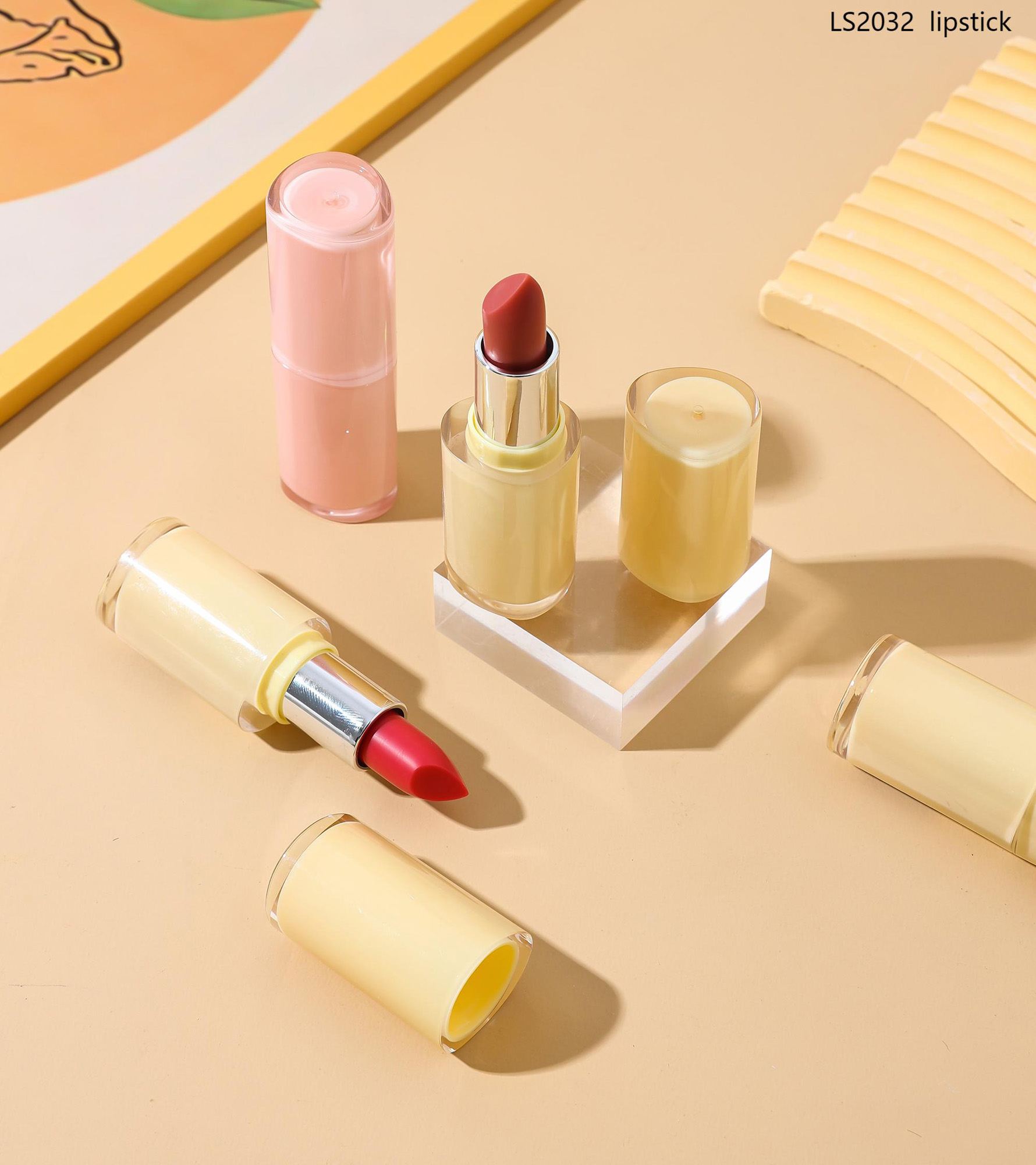
Bold Shades: Reds, Berries, and Beyond
Bold colors demand precision. Fair skin shows every undertone mistake.
Cool Fair Skin Bold Choices
Blue-based reds shine here. Cherry red. True blue-red. Berry plums. These make teeth whiter. Skin brighter.
Avoid orange-reds or corals. They clash. Create muddy contrast.
Pigment tip: High red oxide + blue toners. Minimal yellow. Black for depth without graying.
Warm Fair Skin Bold Choices
Brick reds. Terra-cotta. Warm corals. Orange undertones pop against golden hints.
Blue-based reds often look harsh. They drain color.
Pigment tip: Boost yellow oxide. Add red for fire. Keep blue low.
Neutral Fair Skin Bold Choices
Both worlds work. True red. Soft plum. Experiment freely.
Common Pitfalls and How to Avoid Them
Many lines fail fair skin users. Here’s why.
-
Ashy look: Too much cool pigment on warm skin. Or excess black oxide.
-
Dirty/sallow: Yellow-heavy on cool skin.
-
Washed out: Low pigment load overall.
Fixes come from lab testing. Swatch on diverse fair models. Measure colorimetry. Check undertone clash. Adjust ratios iteratively.
Data point: In wear trials, mismatched undertones drop satisfaction 40–60%. Matched ones boost “flattering” ratings sharply.
The Role of Formulation Beyond Color
Undertone match only starts with pigments. Base affects payoff.
Matte finishes mute undertones slightly. Satin or creamy let them shine through.
Long-wear polymers lock color. Prevent feathering on thin fair lips.
Hydrators (jojoba, shea) keep pale lips from cracking. Dry lips highlight mismatches.
Why Precision Matters for Brands
Consumers notice. They return to lines that “get” their skin. Brands that offer undertone-specific guides or curated fair skin collections win loyalty.
Custom manufacturers build these capabilities in. They run shade libraries. Test on varied fair panels. Deliver ready-to-launch lines.
About Limei
Limei serves as a trusted B2B cosmetics manufacturer. The company specializes in color cosmetics. This includes premium lipsticks, lip gloss, and more for face and eyes. Focused on OEM and ODM services, Limei partners with brands globally. They offer custom formulation, private labeling, and steady wholesale supply. Strong R&D and tight production controls help clients launch high-quality, skin-tone-aware lipsticks—perfect for targeted fair skin collections.
Conclusion
Undertone matching turns good lipstick into great. For fair skin, small pigment tweaks create big differences. Cool tones love blue-based depth. Warm tones glow with yellow warmth. Neutrals bridge easily. When done right, nudes look effortless. Bolds feel powerful. Lips enhance the face instead of competing. That level of color science builds products people reach for daily.
FAQs
What lipstick shades work best for cool fair skin?
Cool fair skin pairs well with blue-based reds, berry tones, mauves, and rosy nudes. These shades brighten the complexion and make teeth appear whiter. Stay away from heavy yellow or orange bases—they can look ashy or off.
How do I pick lipstick for warm fair skin without it looking muddy?
Go for warm-leaning shades like peachy nudes, brick reds, terracotta, or coral-tinged colors. These echo golden undertones naturally. Avoid strong blue-based reds or purples—they often clash and drain color from the face.
Why do some nudes look ashy on fair skin?
Ashy results usually come from mismatched undertones. Yellow-heavy pigments on cool skin create a dull veil. Or too much black oxide muddies the tone. Proper red oxide balance keeps nudes fresh and flattering.
Can neutral fair skin wear both cool and warm lipsticks?
Yes. Neutral fair skin handles a wide range. True pinks, soft plums, or balanced beiges often work seamlessly. Test swatches on your lips—neutral undertones adapt without strong clashes.
How important is undertone matching in lipstick formulation?
Very important. Wrong pigment ratios (too much yellow on cool or blue on warm) cause common complaints like “sickly” or “dirty” looks. Precise adjustments in iron oxides and toners deliver shades that truly flatter fair skin tones.